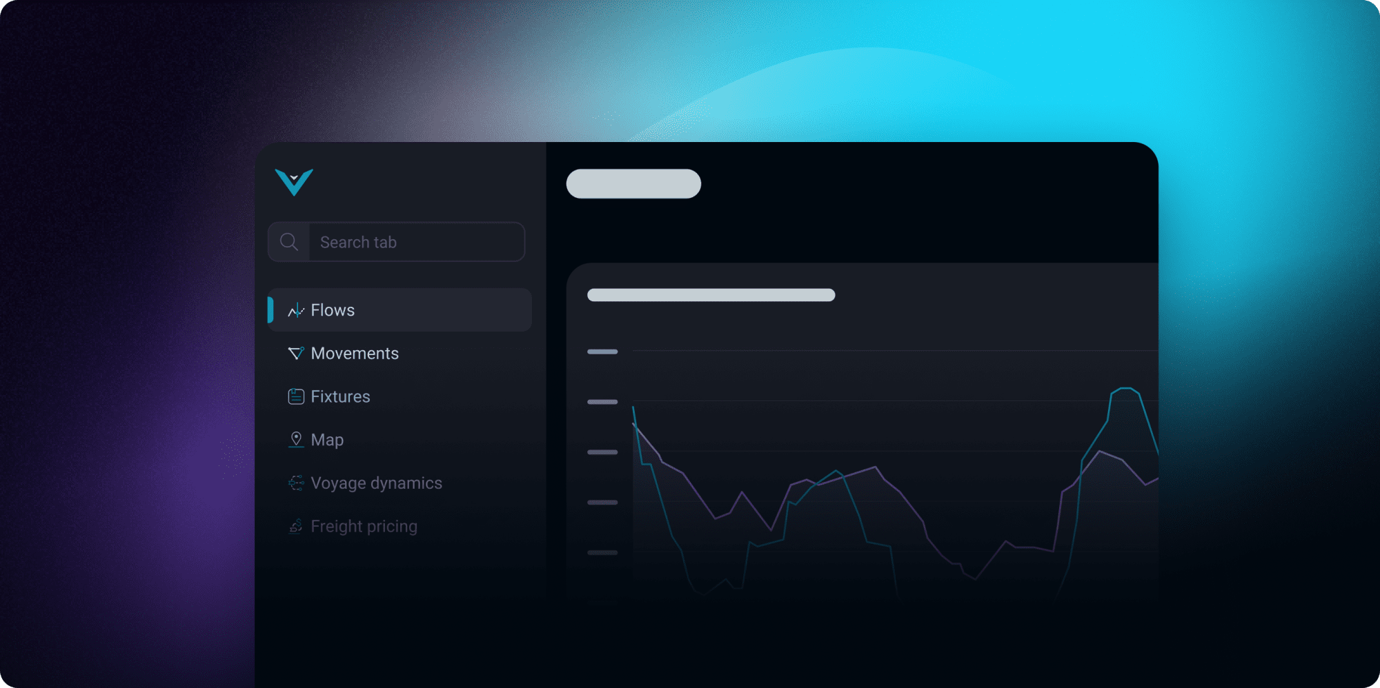
A fresh, more focused Vortexa
Enhance your analytics workflow with our upgraded navigation menu, making it easier to organise and find your tabs

We’re thrilled to announce a major design upgrade on our platform that will help enhance your analytics workflow efficiency with improved organisation and a seamless experience.
This new design allows you to:
- Gain faster and easier access to your insights
- Arrange your customised tabs to suit your preferences
- Enjoy a cleaner, more organised interface
Rethinking the hierarchy
The top navigation menu has been handling a lot of heavy lifting for us in the past, such as switching between all of the open tabs, changing filters, searching for vessels, managing settings, and much more. While we’re thrilled to see people becoming “super users” of the platform, with multiple tabs open to cover a comprehensive view of the market, it made us realise that we needed to rethink our navigation to bring efficiency to your daily workflow continuously.

By introducing a side navigation menu, you can organise your tabs more easily and be able to access them faster. By defining these spaces more concretely, you will now be able to know where to find things based on common practices and familiar layouts.

Enhanced organisation
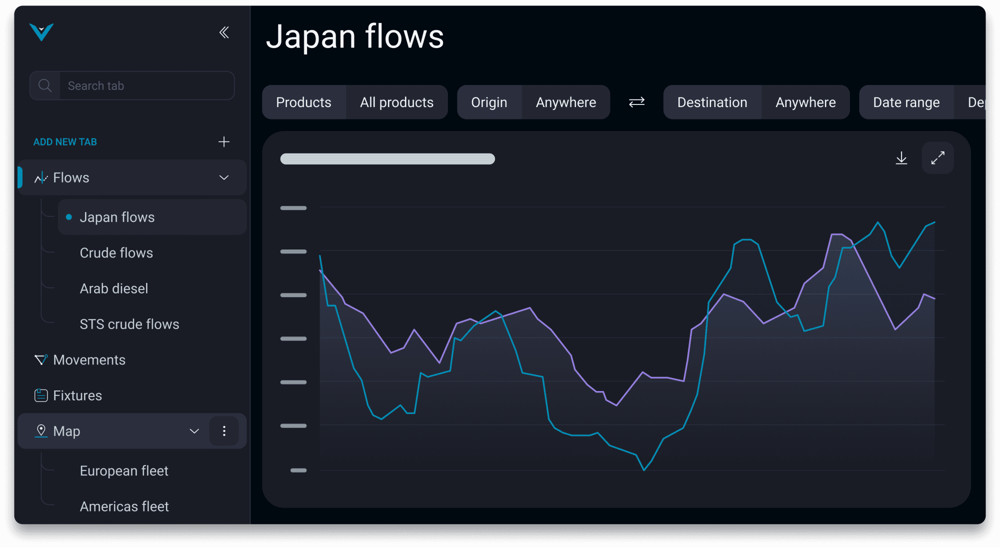
The most noticeable change is that you now have a side navigation. Within this layout, there are other exciting new capabilities, including:
What more?:
- A new, dedicated view for all your working tabs
- A search bar that allows you to quickly find any tab
- Drag & drop any tab to better streamline your workflow
- Grouping system allowing you to organise all of your tabs

Entering a new era of user experience
Vortexa’s mission has always been to provide our users with the easiest and most intuitive access to the highest quality data possible, and we’ve built this new experience with that in mind. We’re constantly launching new features to help enhance your analytics workflows – this new design will help us deliver faster and more dynamic innovations to you in the months and years ahead.
The new navigation is now live to our users and I’m incredibly proud of the team that worked to make the navigation what it is today. Teamwork played a crucial part in rethinking and creating a sustainable design.
There are a lot of great product updates coming on the heels of this navigation. It’s a really exciting time here at Vortexa as we shape our product to new heights and I can’t wait for you to see what’s next.